Arctic Travels
Project Details
UX UI Designer
3 weeks
Figma, Figjam, Canva
Problem
Arctic Travels, a luxury ski and snowboard travel agency, needed a digital experience that reflected its premium brand.
Solution
The final design delivers landing and supporting pages that blend luxury branding with clear flows and a trustworthy, user-friendly experience.
Prototype shows navigation of homepage, destination and booking pages.
Process
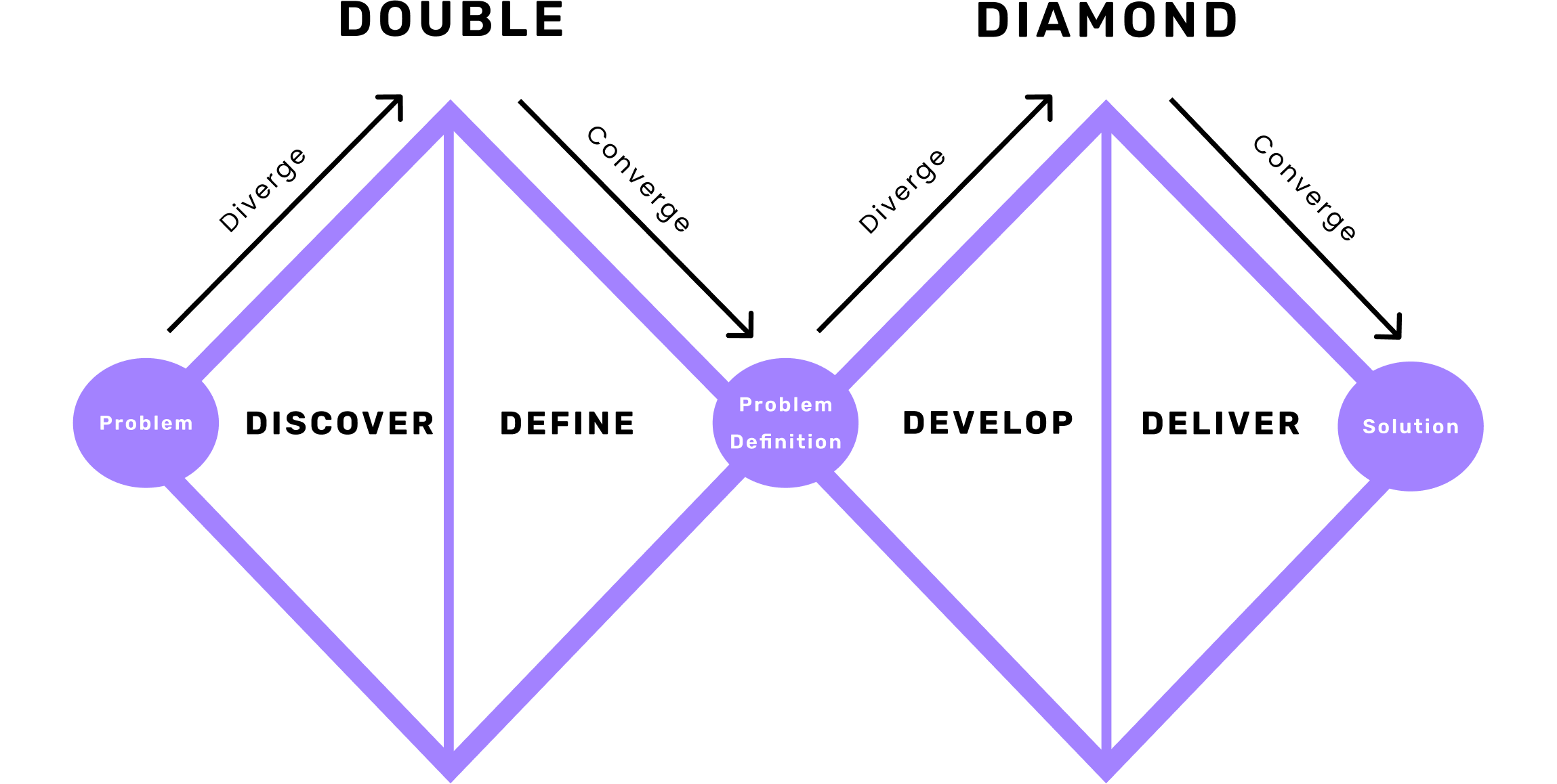
The goal was to create a digital experience that balances adventure, trust, and luxury. Using the Double Diamond process, the project was guided from research to final design with the user at the center.
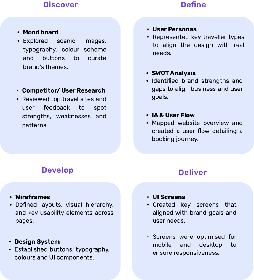

Competitor Analysis
To understand the ski and broader travel markets, I created a colour-coded affinity diagram comparing direct competitors (WeSki, Crystal Ski) and indirect competitors (Booking.com, Expedia), with additional context from Skiworld and Trivago.
This revealed that direct competitors excel in destination experiences, while indirect competitors provide stronger booking flows and overall UX, offering key insights for designing a seamless user journey.
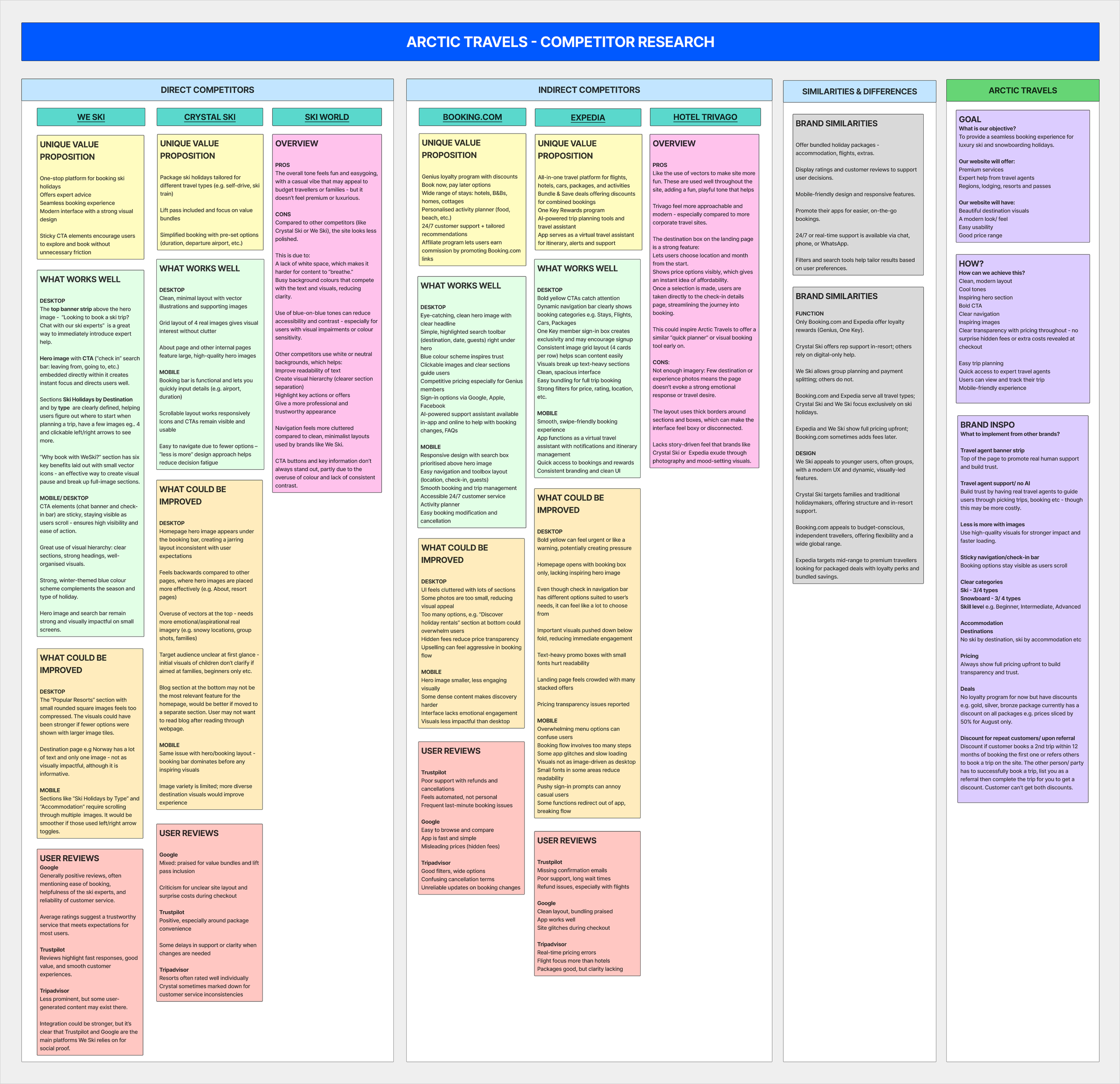
Competitor research table - direct/ indirect competitors
User Research
To inform key page designs, I created a 10-question survey exploring users’ expectations and priorities for a luxury travel website.
Single-choice questions captured demographics and habits, while multiple-choice questions identified important features and content.
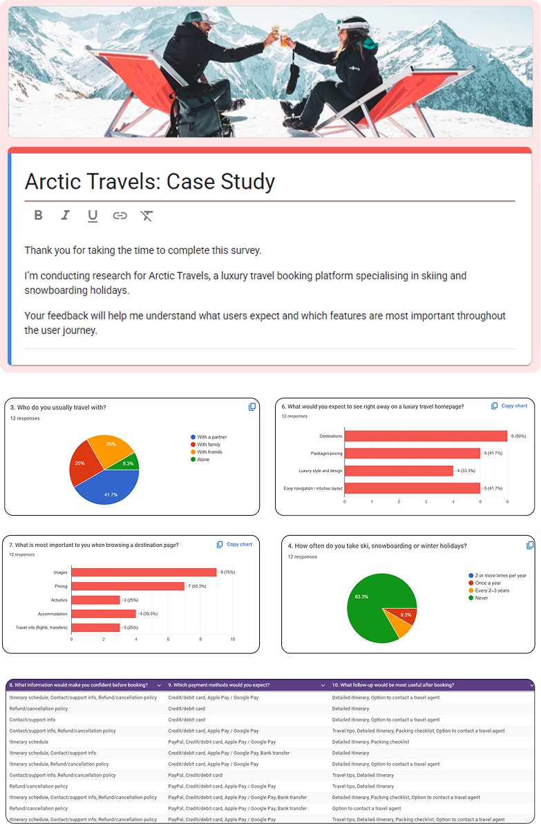

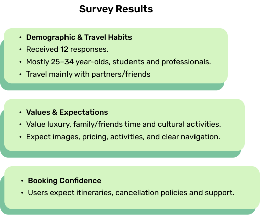
“Users prioritise relaxation and family time over sports and skiing, which challenged my initial assumptions about winter holiday motivations.”
User Personas & SWOT
I conducted a SWOT analysis using insights from the affinity map and user personas to refine Arctic Travels’ strategy.
Key takeaways highlighted the need for flexible packages and trust-building through third-party testimonials to enhance credibility and user confidence..

User personas
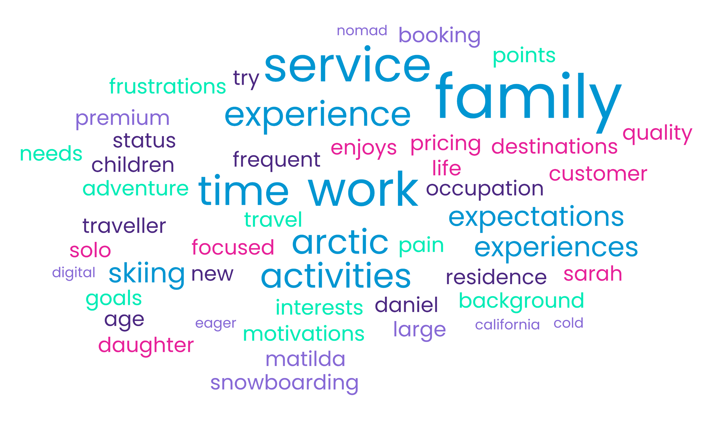
Word cloud

SWOT analysis
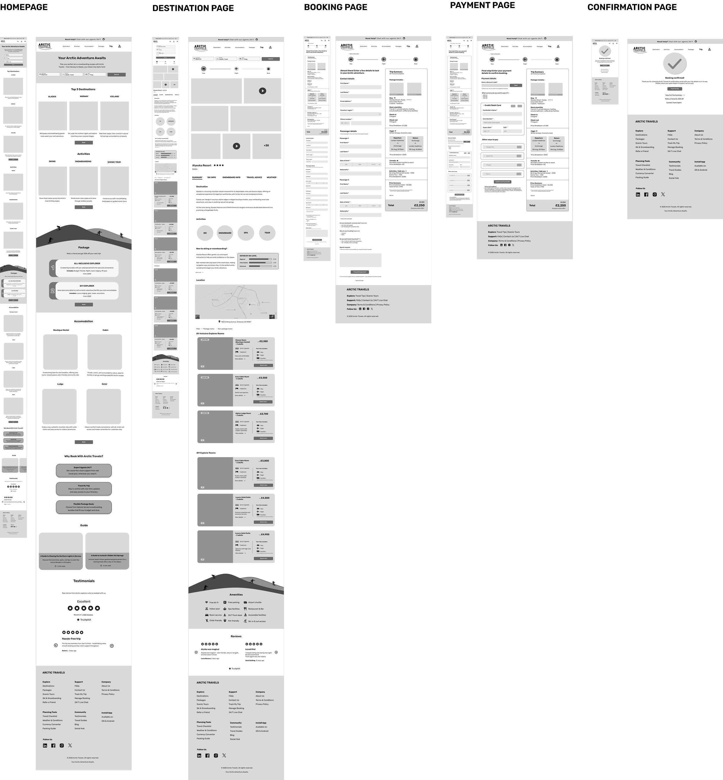
Information Architecture
I designed an information architecture with five core pages, using clear labels and curated options to simplify navigation.
The homepage flows from hero and booking bar to curated offerings and testimonials, while package choices were streamlined to All-Inclusive and DIY Explorer to align with user needs and encourage bookings.

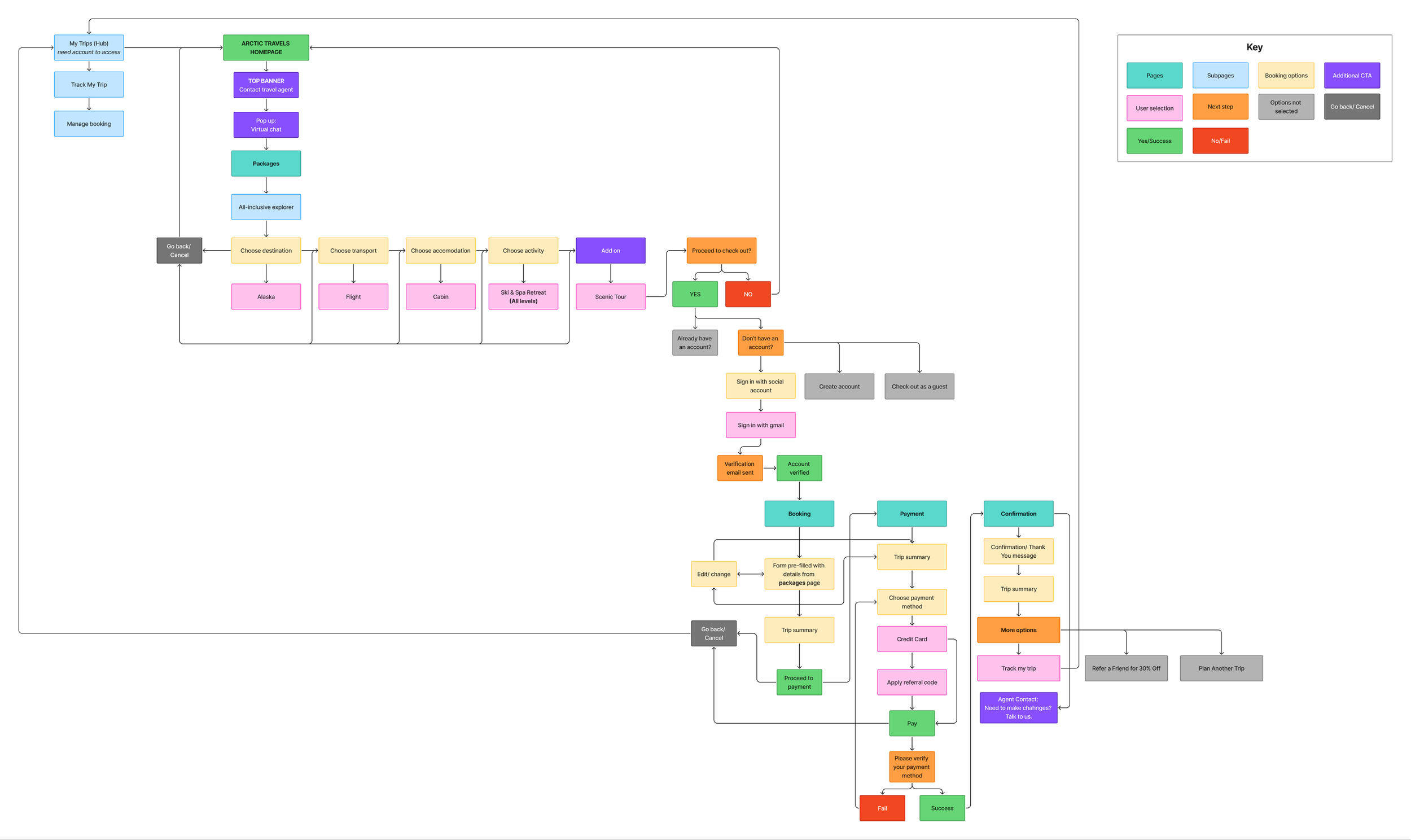
User Flow
The user flow maps key steps a user takes to book a trip, designed to be smooth, efficient, and user-friendly. Some areas (like the blog) may be skipped, while others (like testimonials) are optional.
Inspired by competitors like We-Ski, I included a top banner highlighting agent support, which is also available during checkout (e.g., on the confirmation page users can contact an agent to modify their booking). This reinforces Arctic Travels’ commitment to personalised support.
Sarah’s User Journey
This user flow follows Sarah Andrews booking a trip for herself and her daughter. She discovers Arctic Travels via a friend, chats with a virtual agent, selects the All-Inclusive Explorer package, signs in with Google, and updates her activities.
Pricing is clearly shown, payment is completed, and she accesses her trip details and tracking via the My Trips hub, highlighting a seamless, transparent booking experience.

Wireframes
I sketched homepage and destination layouts to explore feature placement and flow, using these insights and user research to inform the high-fidelity wireframes.
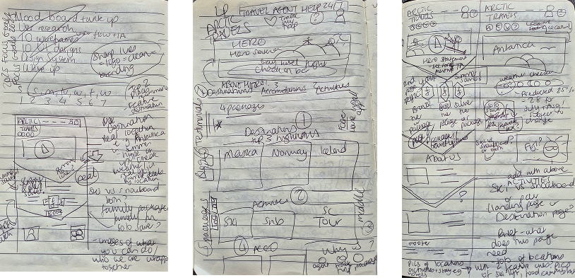
Lofi wireframe sketches of homepage and destination page
Wireframes
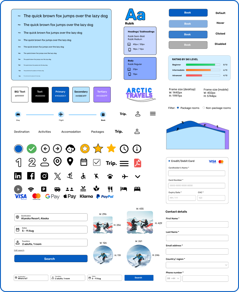
Design System
UI Screens

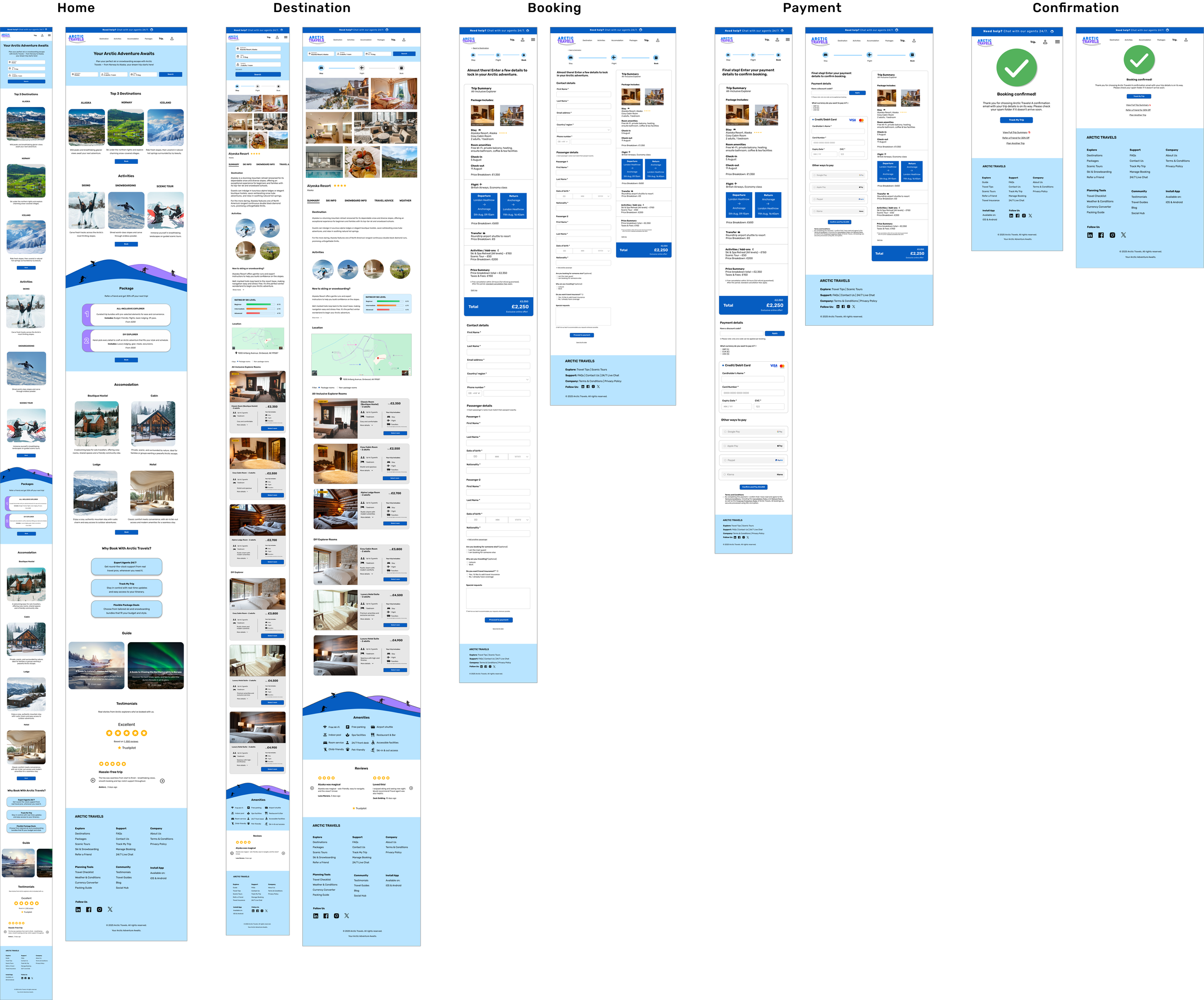
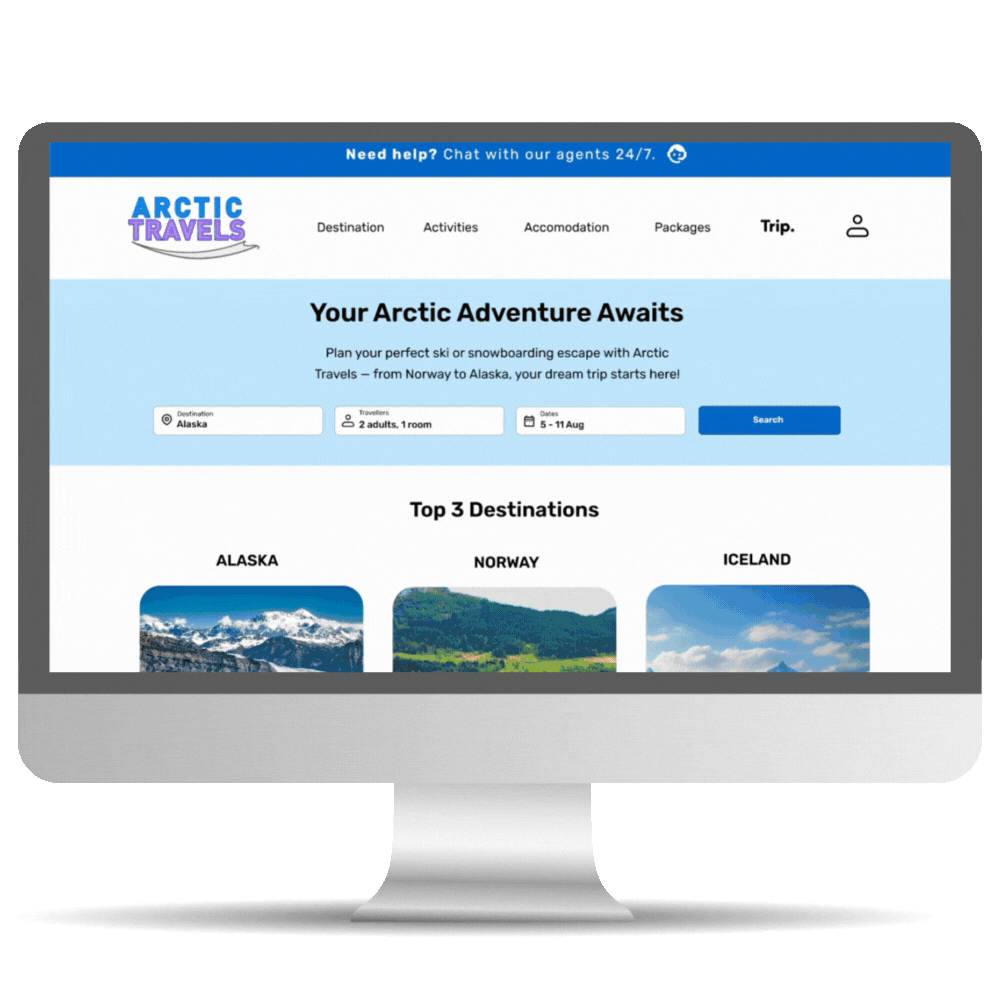
Homepage
A minimalist layout highlights key sections, with subtle ski-slope dividers drawing attention to important information.
Destination
The check-in bar sits at the top for easy access, while immersive image cards showcase the destination and refined package cards allow simple room comparison.
Booking
A structured form with a trip summary, back links, and edit options ensures clarity and flexibility while maintaining transparent pricing.
Payment
Final pricing and terms are shown alongside secure payment options.
Confirmation
A simple, reassuring page with a success tick and accessible trip summary link reinforces trust and clarity post-purchase.
Reflection
I learnt how vital user research is for shaping designs that meet real needs. Testing with real people helped me challenge assumptions and adapt to their feedback. Creating five pages for desktop and mobile was initially challenging, but refining each decision against user experience, industry standards, and brand goals helped me grow as a designer.
Next steps include conducting usability testing with real users to validate the design and make improvements based on their feedback as well as improving accessibility and responsiveness across devices.
AfriCarib