AfriCarib
Project Details
UX/ UI Designer/ Group Lead
Figma, Figjam, Canva
3 weeks
Group Members
Rayshaun
Tanya
Abigail
Danielle
Problem
Africarib needs to expand their reach beyond in-store shoppers. Without a strong digital platform, they risk losing customers to competitors with online shopping options.
Success would mean providing an intuitive and accessible e-commerce solution that increases convenience and widens Africarib’s customer base.
Solution
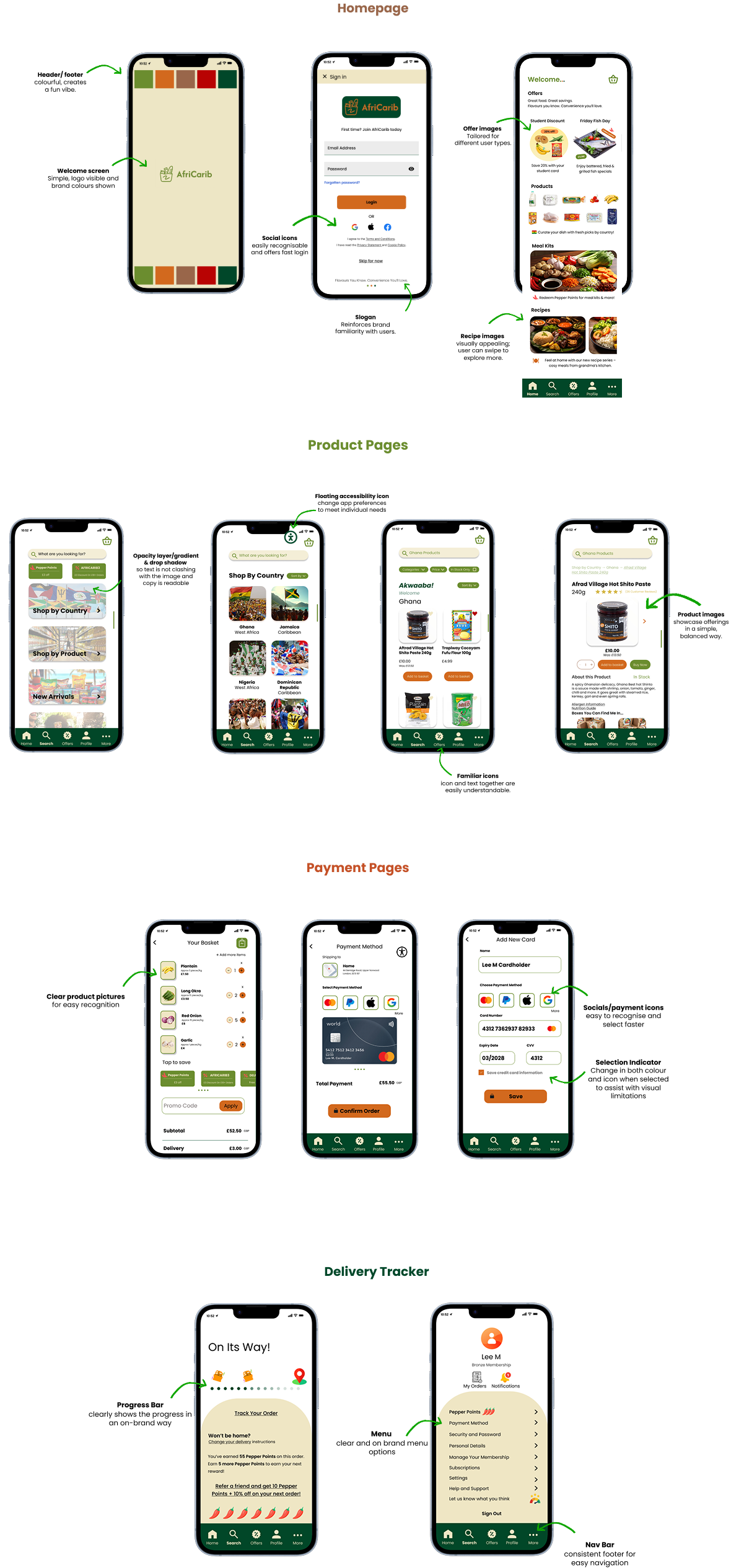
We designed five key UI screens; Home, Product Listing, Product Details, Cart and Checkout that enable users to easily browse, search, and purchase groceries online.
The flow was optimised for quick ordering and repeat purchases, supporting Africarib’s goal of expanding their reach through a seamless, user-friendly online experience.


Process

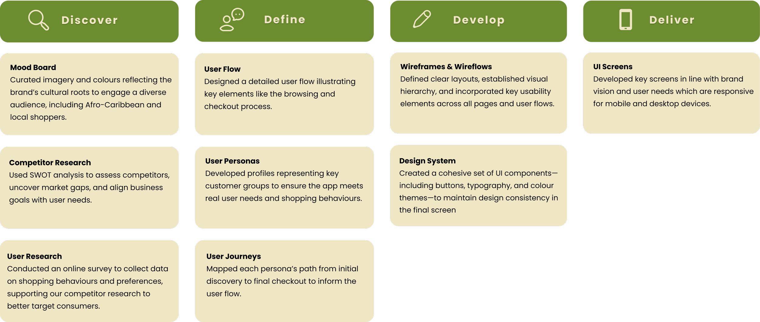
Mood Board

Competitor Analysis
We looked at six food delivery platforms—three indirect (Lidl, Cook Food, Hello Fresh) and three direct (Samisonline, Afrobox, Afrobasket)—to see how Afri-Carib compares. We focused on UX, visual design, navigation, product discovery, checkout flow, and mobile responsiveness to spot strengths, weaknesses, and opportunities to stand out.

User Survey
We ran an online survey to understand user needs, behaviours, and pain points to inform design decisions alongside competitor analysis.

Survey Insights
Demographics & habits:
Received 23 responses.
Mixed ages (20+); mostly in-store shoppers; 70% tried online but often preferred in-store.
Pain points
Limited item choice, delivery fees, confusing navigation, out-of-stock products.
Preferences
Fast delivery, saved baskets, clear images, simple checkout; cultural relevance moderately valued.
Trust factors
Professional site, positive reviews, usability; dislikes included lag, poor stock info, ads, and hard navigation.
Survey Results

Brand Goals
Build trust through professional branding, positive reviews, and clear communication.
Prioritise cultural familiarity, inclusivity, and accessibility.
Give users control with saved baskets, delivery options, and product preferences.
Deliver a fast, intuitive, and seamless experience with clear navigation and minimal loading delays.
Provide meaningful, relevant content that resonates culturally with users.
User Personas


After creating the personas, we mapped out each person’s journey from discovery to delivery, capturing their goals and key touchpoints along the way. These insights guided decisions for our user flow, ensuring it addressed real user needs and behaviours.
User Flow


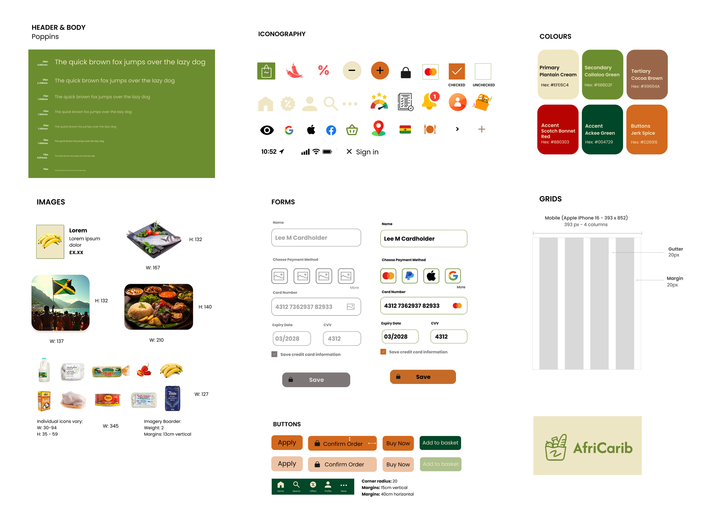
Design System

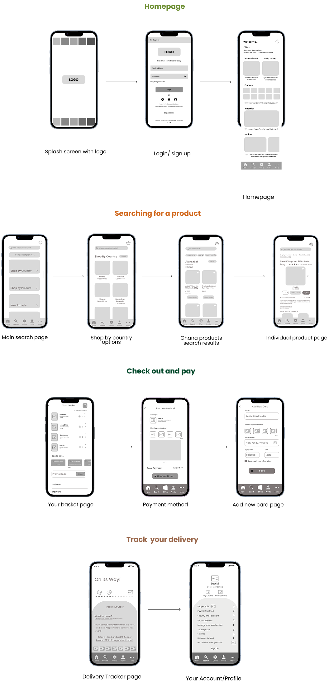
Wireflows

UI Screens

Collaboration
Working in a team required coordinating both schedules and perspectives. As the group lead, I created key documents—including a brief overview, a progress tracker, and meeting notes—to keep everyone aligned and on schedule.
I consistently monitored our progress, suggested design improvements, and helped the team stay on track. Despite a few challenges, I was fortunate to work with a highly engaged group that was passionate about our brand.
We shared ideas, built on each other’s creativity, and split the workload effectively which resulted in a strong product.
Next Steps
The next phase will focus on usability testing to identify friction points and gather feedback for improvements. We’ll also track key metrics like popular filters and bundles, completion rates, drop-offs during checkout or onboarding, meal kit vs. grocery preferences, and user feedback.
Arctic Travels
Lux Car Co.